Brand Management
Brands are built to be a representation of who you are as a business or organization. Branding increases the value of business or organization, generates new customers, creates trust, and supports advertising efforts. National Park College's brand includes our name, logos, style and voice in all external outreach. Following the guidelines contained in this style guide will help maintain a consistent brand identity.
Style Guide
Colors
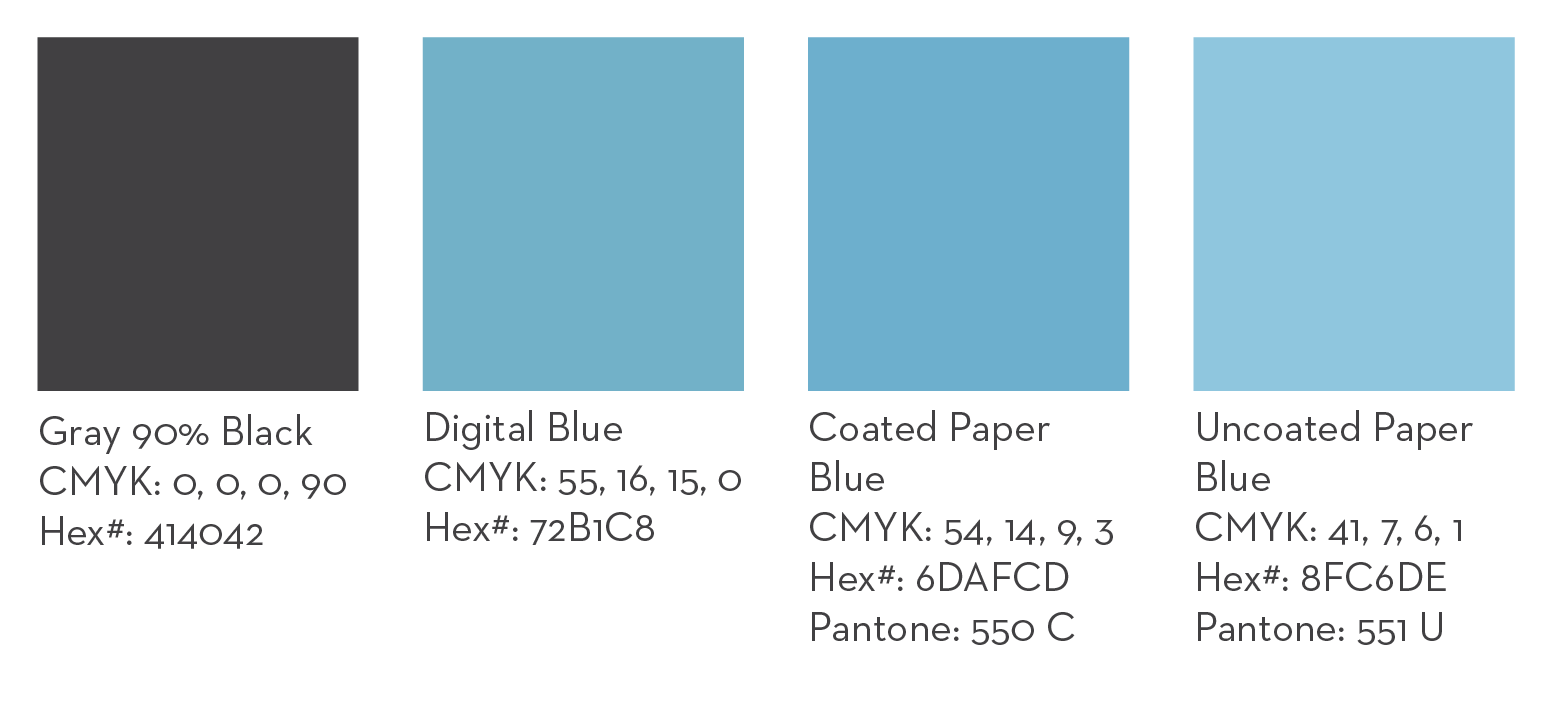
Color is a visual indicator of identity, and consistent reinforcement of the brand colors builds audience awareness and recognizability. National Park College's colors are blue, white, and dark grey. Publications and other promotional materials should be predominantly themed in the approved shades listed in this style guide.
NPC blue has been updated to include variations of blue based on use. Please note above that if using NPC blue for a digital format, you will use the Digital Blue. If using NPC blue in print, please note that you will need to know the type of paper you are printing on. If the paper is coated or dull, you will use the Coated Paper Blue and if the paper is uncoated, you will use the Uncoated Paper Blue option.
Grey (90% Black) CMYK: 0, 0, 0, 90
White CMYK: 0 ,0, 0, 0
Typography
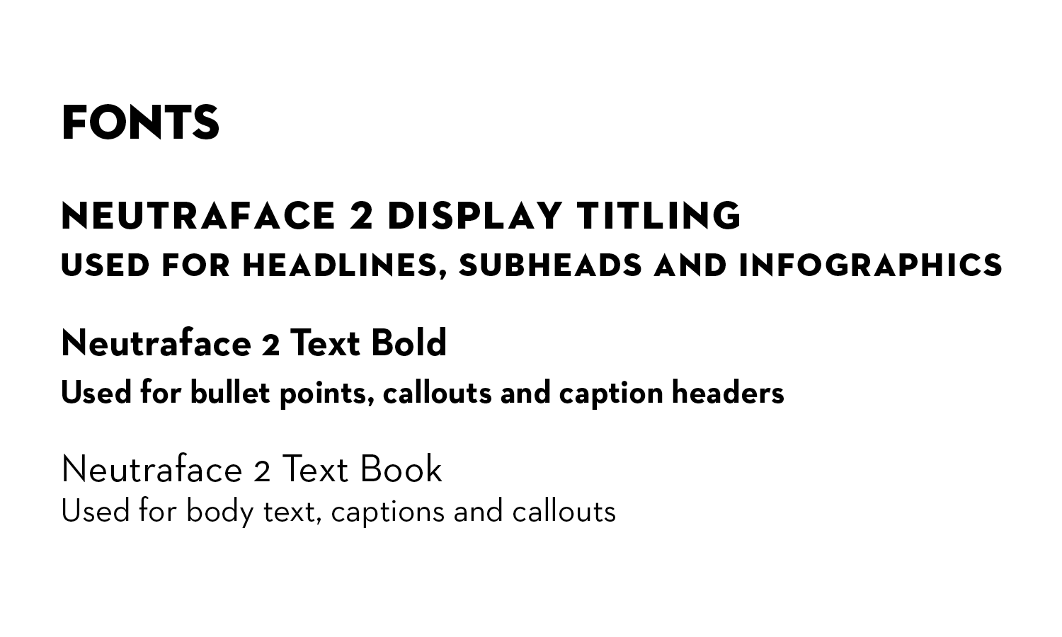
The official font for National Park College is called Neutraface. We use Neutraface Text in both book and bold as well as Neutraface Titling in bold and display. Jost is an approved font for use when Neutraface is unavailable. Always choose sans serif fonts over serif fonts. Highly stylized fonts, such as scripts and other novelty fonts, are prohibited unless given special permission by Advancement.
NPC Institutional Logos
![]()
![]()
The interlocking NPC letter logos, also known as academic or institutional logos, are used for general promotion of the College. The institutional logo is the cornerstone of the College and is the most immediately recognizable signifier of our brand. These logos are not to be used to promote athletics. Do not use the institutional NPC logo with an athletic mark unless given special permission by Advancement. The logos, wordmarks and ligatures that make up these identities are the property of NPC. All materials with one or more of these elements must be approved by Advancement before going into production. The interlocking NPC letters are not to be used separately from an official logo unless given special permission by Advancement.
Nighthawk Typography
The Nighthawk Athletics font is TJSF Regular. This typeface requires manual kerning and, as a result, is not available for download. Please contact Advancement for assistance in designing with this font.
Nighthawk Logos
![]()
The Nighthawk identity is for athletics use only, including merchandise in the Hawks Nest Bookstore and recruiting materials. These logos are not to be used to promote academics. Do not use the institutional NPC logo with an athletic mark unless given special permission by Advancement. The logos, wordmarks and ligatures that make up these identities are the property of NPC. All materials with one or more of these elements must be approved by Advancement before going into production.
NPC Seal
The National Park College Seal is used in graduation-related materials such as diploma covers. The seal is the property of NPC. All materials with one or more of these elements must be approved by Advancement before going into production. These logos are not available for download. Please contact Advancement for assistance in designing with this seal.
NPC Department Logos
![]()
Department logos add the appropriate department name in the institutional logo. Departments are not allowed to create these logos on their own. Please request a logo from the Advancement office. Existing department logos are available for download, and all materials with one or more of these logos must be approved by Advancement before going into production.
Clear space
To maintain consistency and visual emphasis, it is important to maintain a clear space around the logo that is not broken by other design elements.
Institutional logos
![]()
![]()
The clear space around the square institutional logo must be equal to or greater than the distance between the top of the letter K and the bottom of the letter E in "park" and "college." The clear space around the horizontal institutional logo must be equal to or greater than twice the distance between the top and bottom of the letter L in "national". The clear space around the departmental logo follows this same standard.
Athletics logos
![]()
![]()
The clear space around the primary athletic logo featuring the full Nighthawk and word mark must be equal to or greater than the distance between the top and bottom of the letter S in "Nighthawks." The same standard applies to the secondary and tertiary logos, however, some allowances may be made to the tertiary logo (see example). Please contact Advancement about designing with this logo.
Minimum size
Logos must not be reduced beyond the following standards to preserve legibility. Exceptions can be made for some merchandise including pens. These exceptions will be reviewed by Advancement on a case by case basis.
Institutional logos
![]()
The horizontal institutional logo must not be reduced to less than 1.5" in length. The same standard applies to departmental logos. The square institutional logo must not be reduced to less than 0.75" in length.
Athletics logos
![]()
The primary athletic logo featuring the full Nighthawk and word mark must not be reduced to less than 1.5" in length. The same standard applies to all other Nighthawk word marks and ligatures. The Nighthawk head logo must not be reduced to less than 0.75" in length.
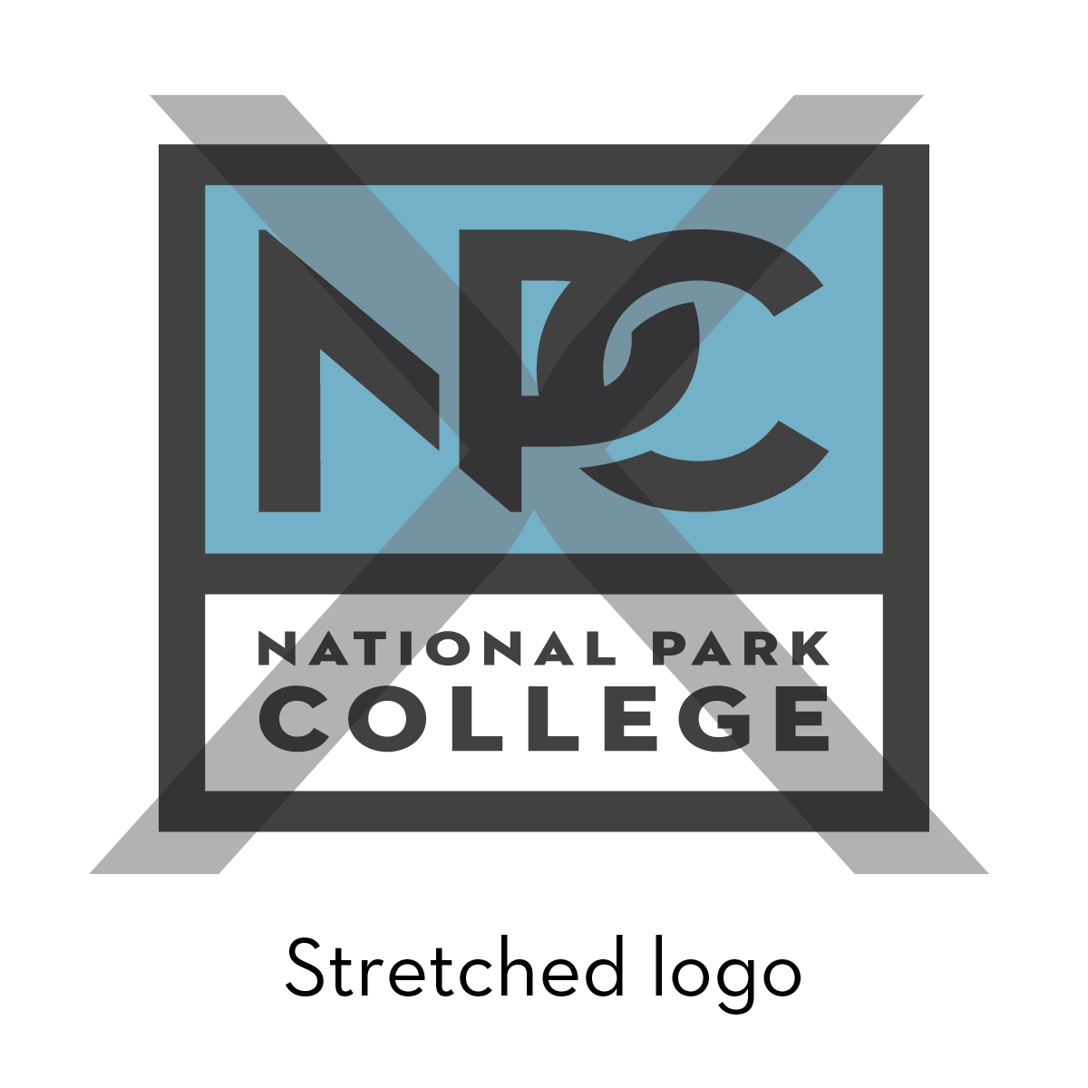
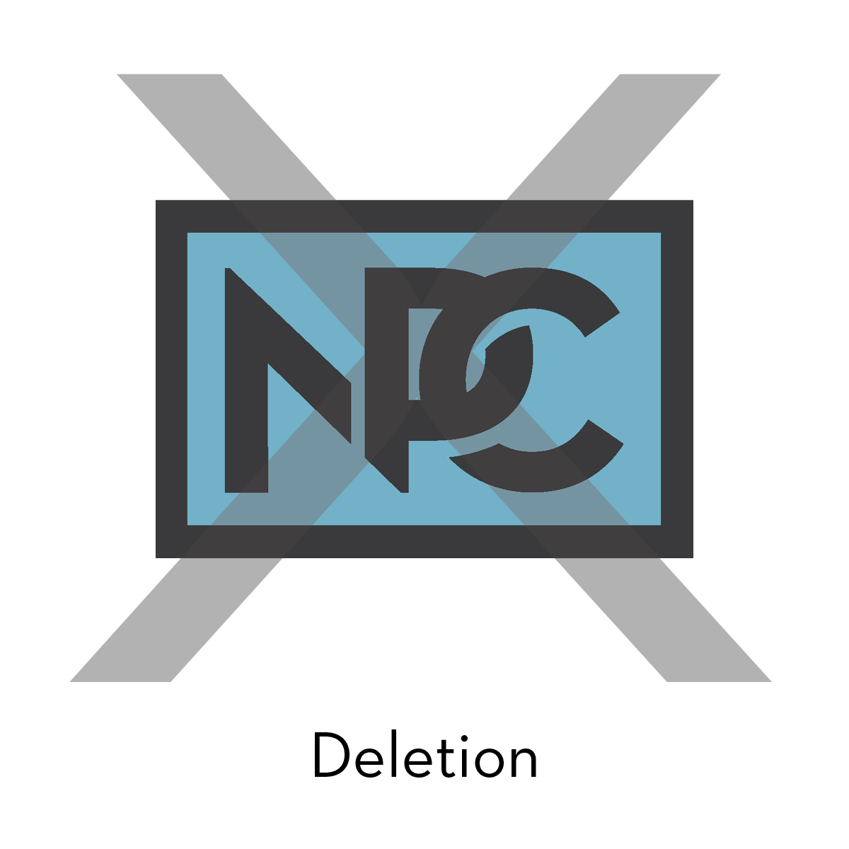
Inappropriate Logo Usage
Never attempt to recreate or alter any logo. The following are examples of incorrect logo usage; however, this is not a comprehensive list:
- Logos must never be stretched or otherwise modified from their original proportions.
- No additions or deletions may be made to the logos.
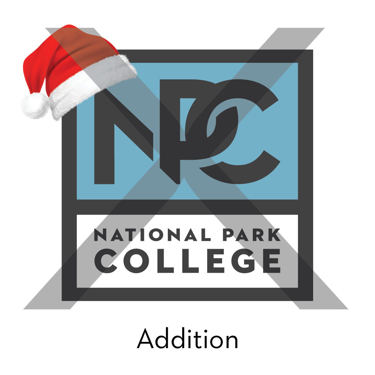
- Do not change the colors of the logos.
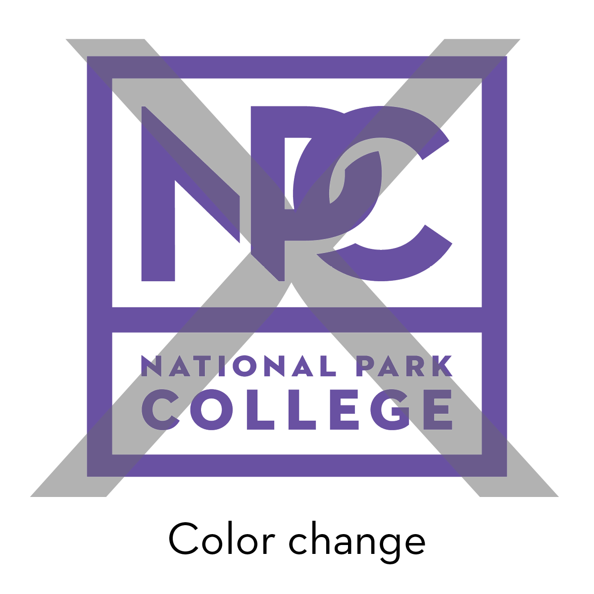
- Do not use the logos over distracting patterns, such as chevrons.
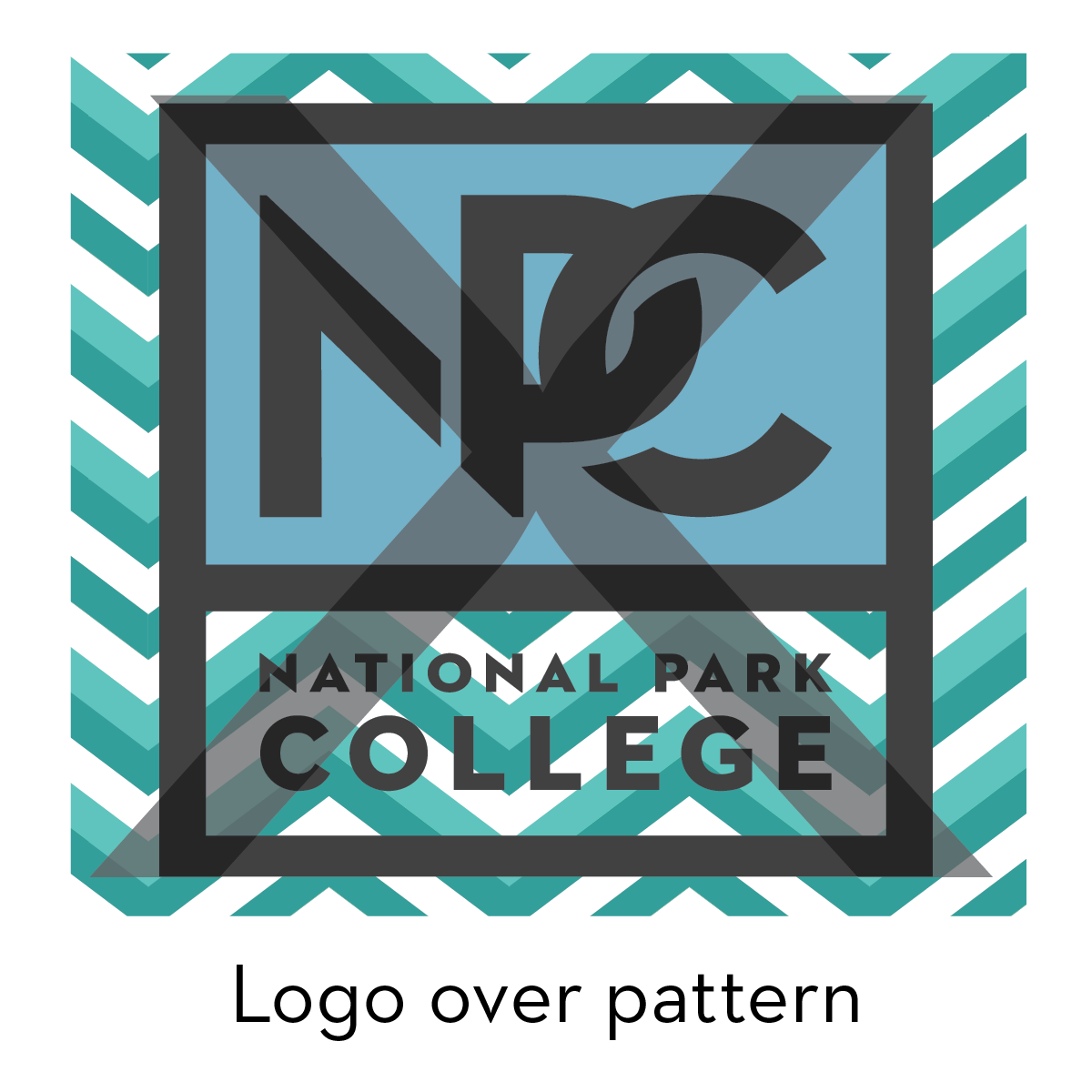
- Do not use a "reversed" Nighthawk logo. Reversing the colors of any Nighthawk logo
qualifies as an inappropriate color change. The legibility of this logo is compromised.
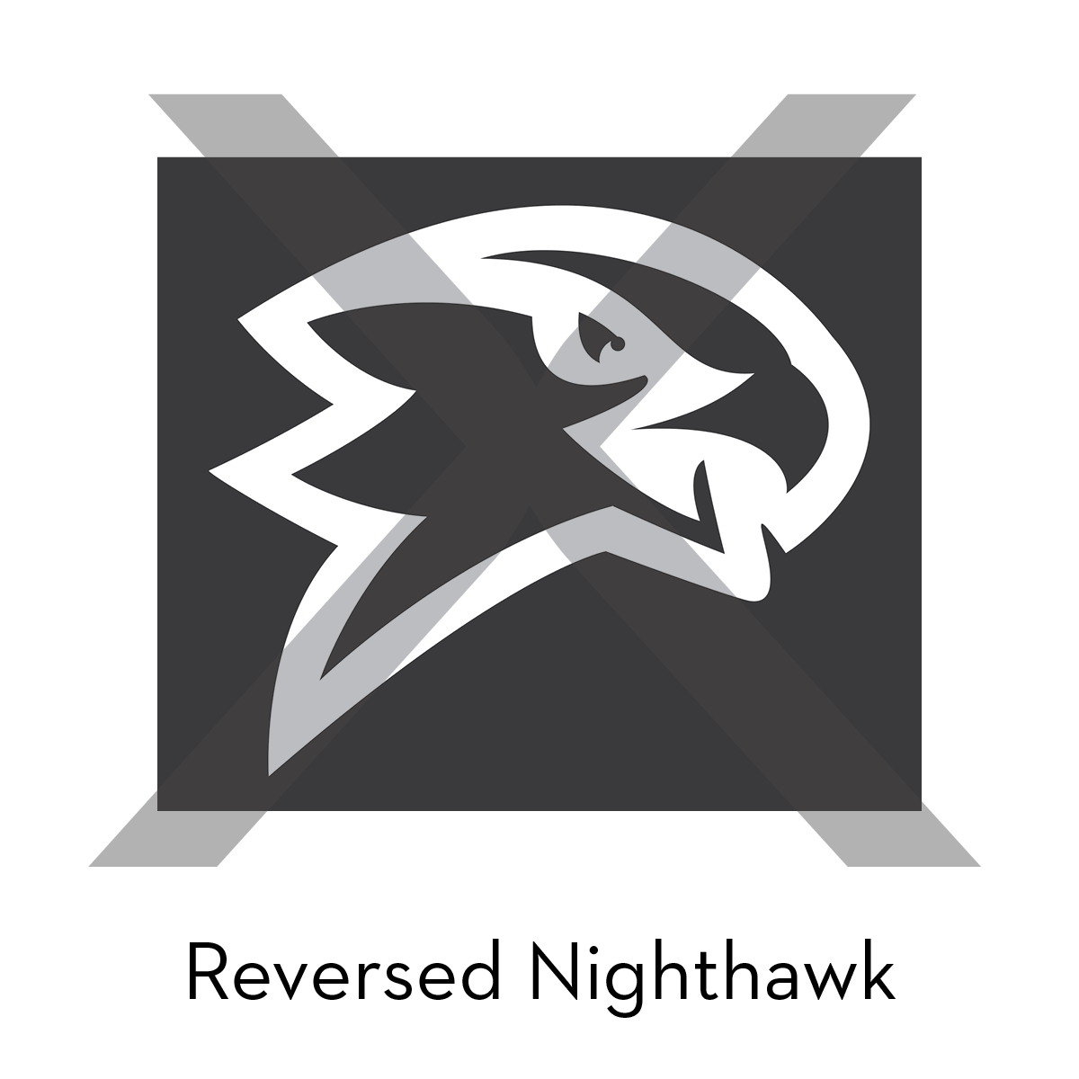
- Do not use old NPCC or discontinued department logos. If you need replacement materials,
please contact Advancement.
Merchandise
The NPC blue color can be difficult for some vendors to match in products such as banners, t-shirts, and more. The Advancement office understands that in the event a vendor cannot replicate the exact Pantone blue color, a reasonable exception may be approved on a case by case basis. Carolina blue is a common color substitute for NPC blue and is suitable for most merchandise. Please contact the Advancement office about using Carolina Blue or any other substitute for NPC Blue.
Carolina Blue CMYK: 31, 16, 0, 13
When ordering merchandise, please adhere to this style guide. Font choices should be sans serif; all materials should be white, black, NPC blue (or Carolina Blue), or a shade of grey. Other materials with patterns, such as tie-dye, or colors outside of NPC branding, can be ordered, but those items may not include any NPC logos. All materials should be legible.
All uses of the NPC name or logo must be approved before ordering promotional merchandise.