Graphic Design
Graphic design is one of the most powerful means of communication in today’s world. It subconsciously affects many of the decisions we make throughout our lives. It can determine how we feel, what we do and how we look. Graphic design plays an extensive role in the way we engage with food, fashion, media, technology and other elements in our lives.
The Marketing and Public Relations office creates graphics that are consistent with NPC branding and follows the guidelines set forth in the style guide. Those graphics include the following: posters, flyers, postcards, mailers, social media graphics, campus monitor slides, D2L graphics, email banners, rack cards, brochures, magazines, catalogs, and more. Learn about these marketing materials below.
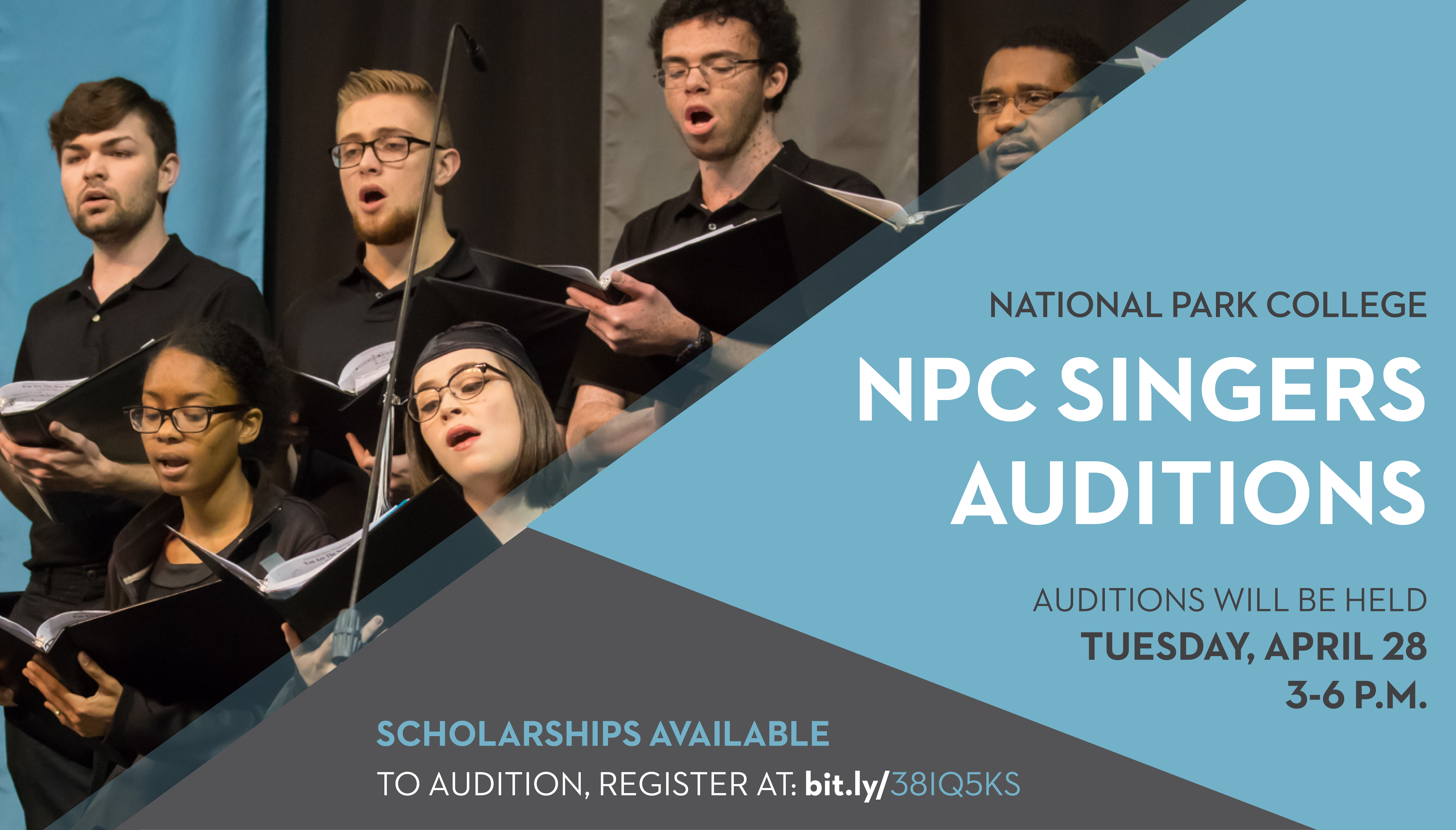
Posters and Flyers
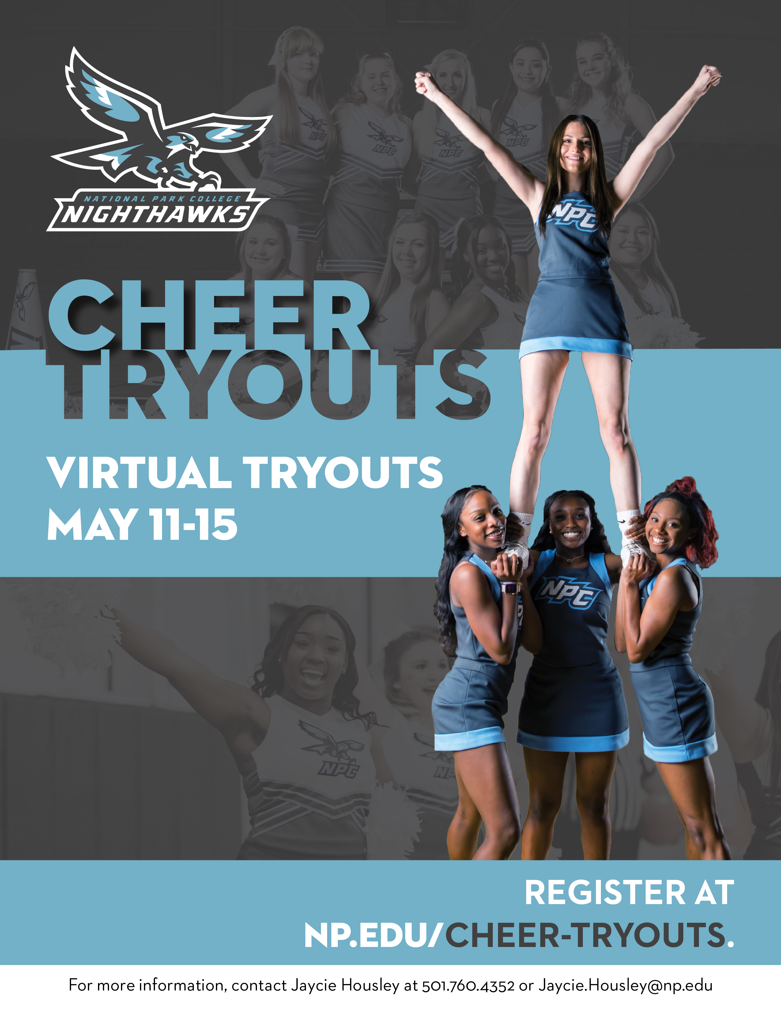
Posters and flyers are designed for print purposes, not digital. They should not be used for email. Posters and flyers should be legible, contain pertinent information for the event, and not be overly cluttered with superfluous details.
Social Media Graphics
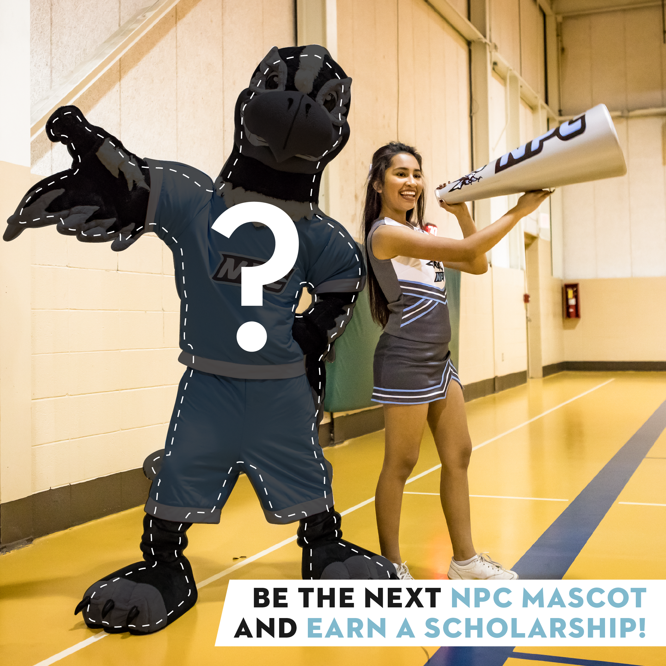
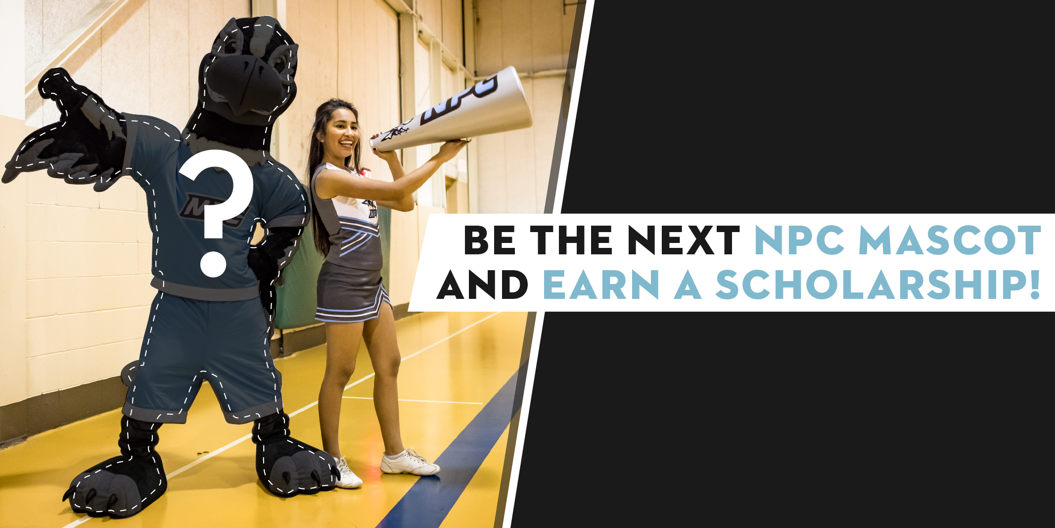
Graphics created for social media are designed to accompany and compliment the text of the post. Graphics should have less than 20 percent text and should include alt-text for screen readers. Graphics for Facebook and Instagram should be square, whereas graphics for Twitter and LinkedIn should have a 2:1 size ratio.
Postcards and Mailers
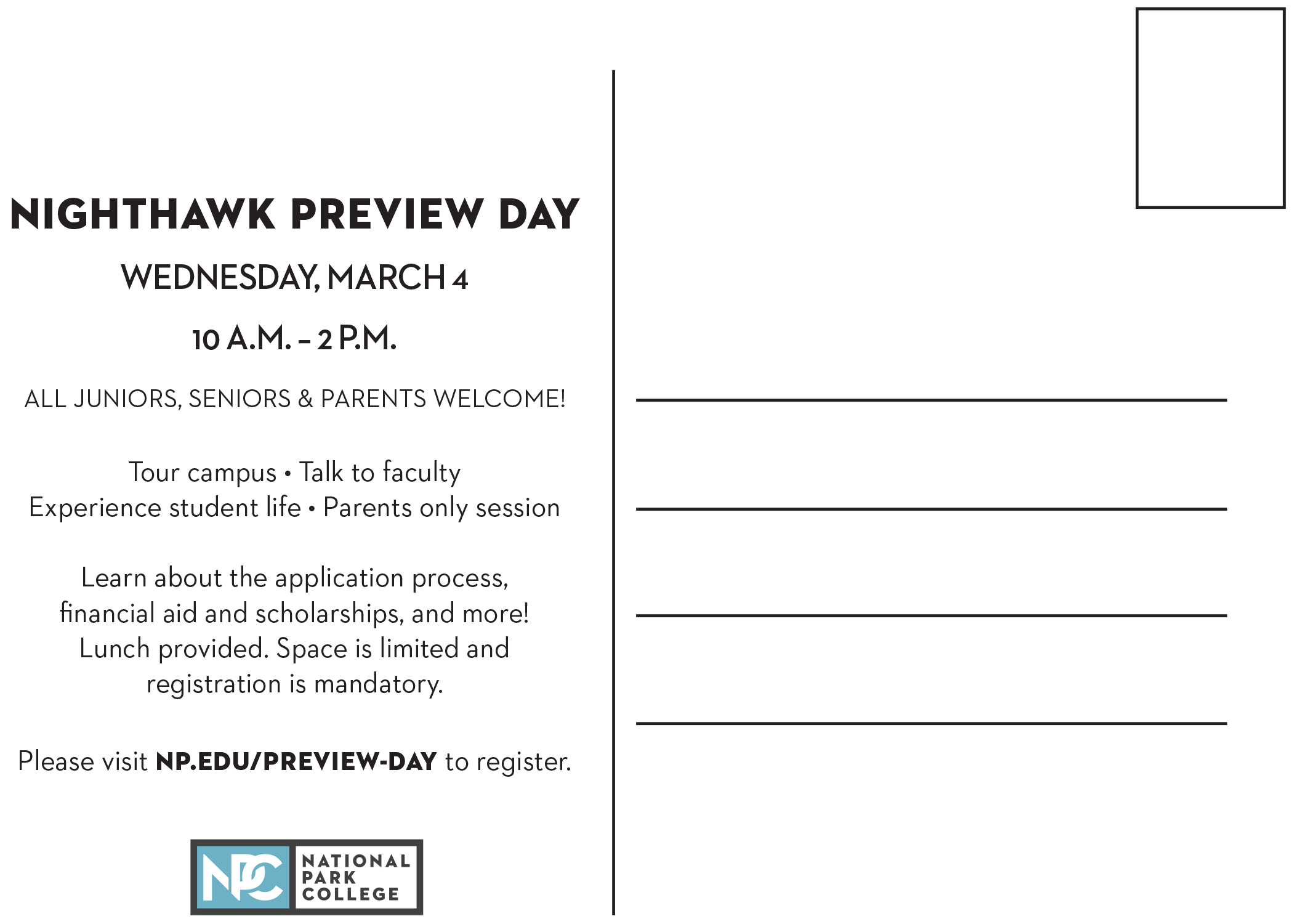
Postcards and mailers are print items designed to be mailed. These items can be designed at a multitude of sizes; however, standard sizes will likely require less postage. Standard postcards sizes include 3x5, 4x6, and 5x7 inches. Letter-size mailers are 11.5x6.125 inches. Postcards and mailers should be legible and simple in design and messaging with a clear focal point.
Brochures
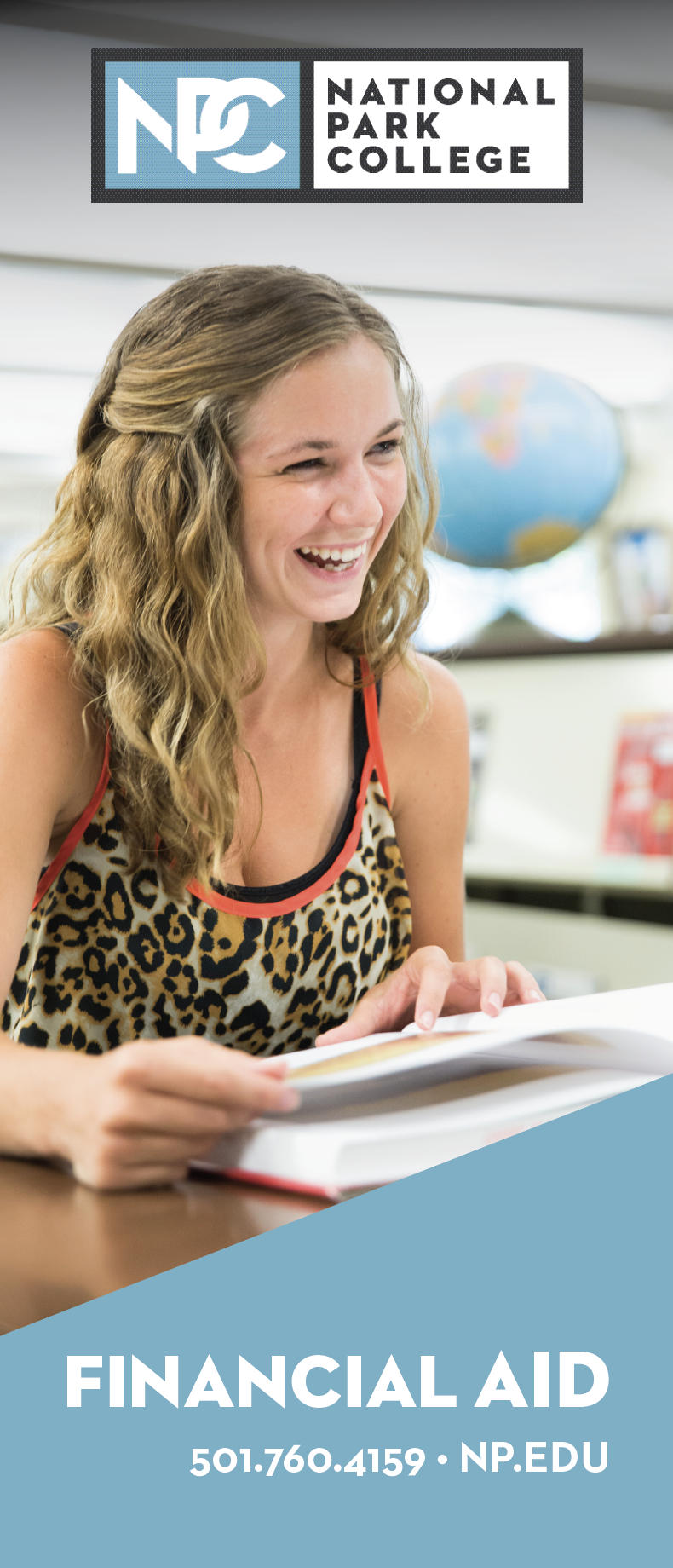
Brochures are utilized when a subject requires too much information to fit into a rack card. Brochures can be created with a variety of folds and pages to best accommodate the information that needs to be conveyed. The Marketing and Public Relations office currently produces the following brochures:
- Financial Aid, trifold brochure
- NPC Overview, double gatefold brochure
Magazines and Catalogs
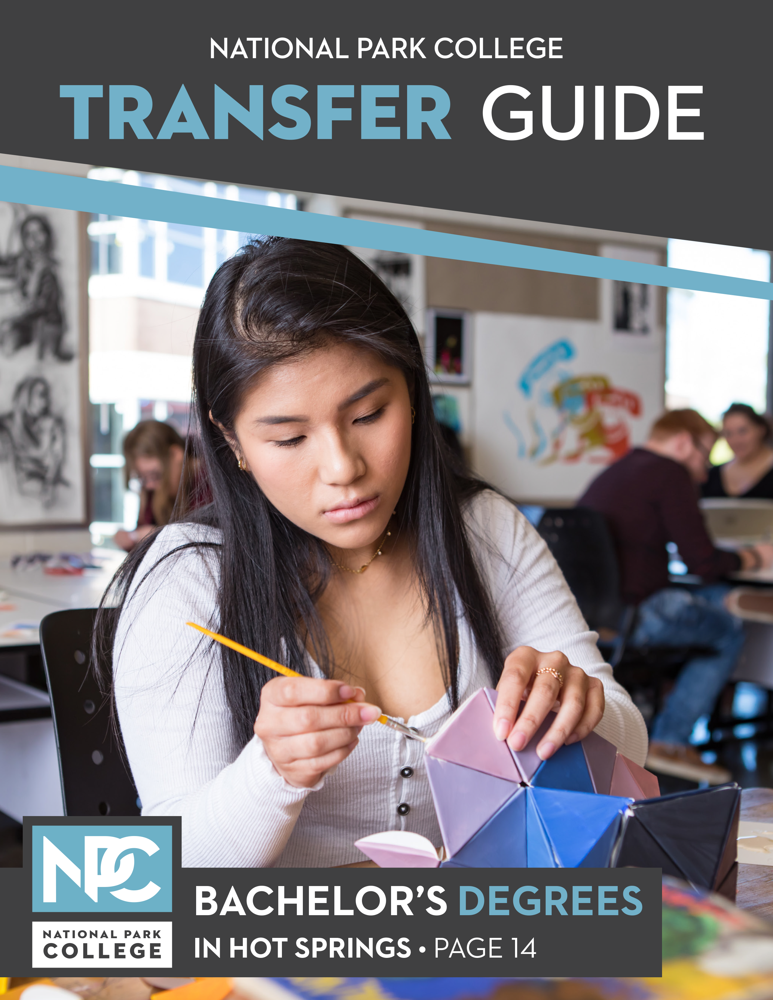

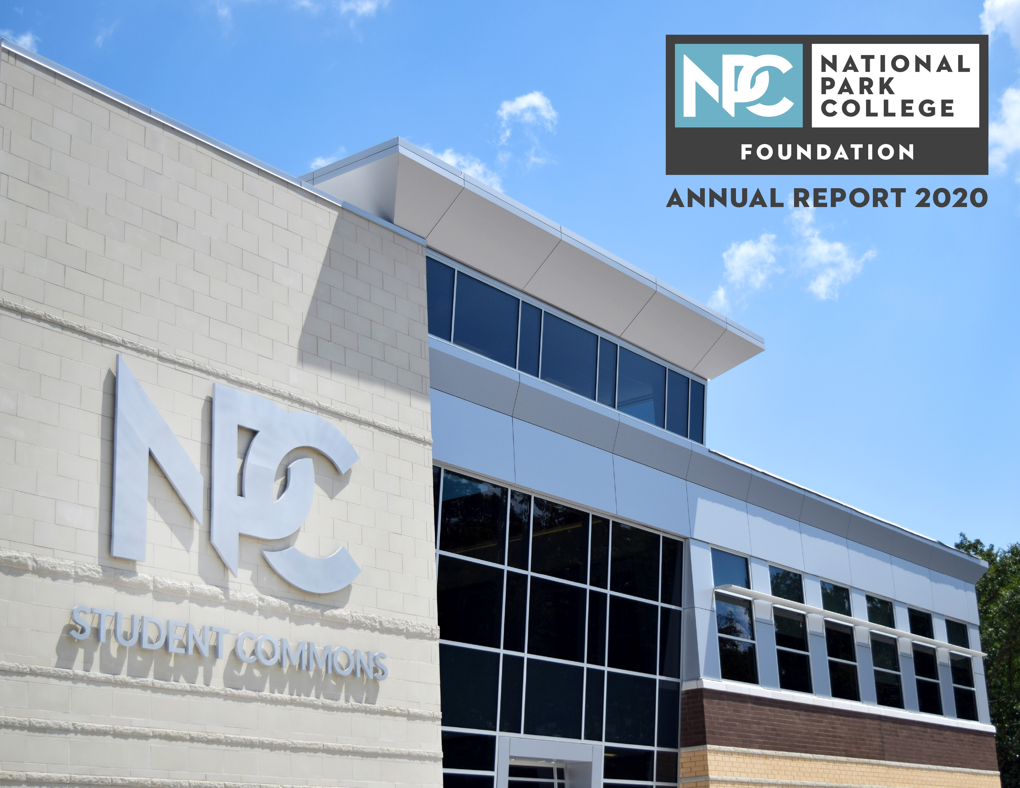
Magazines and catalogs are large publications that take an immense amount of planning and designing. The Marketing and Public Relations office currently produces the following magazines and catalogs:
- The National Park College Transfer Guide, annually
- The Continuing Education catalog, biannually
- The NPC Foundation Annual Report, annually
Program Rack Cards

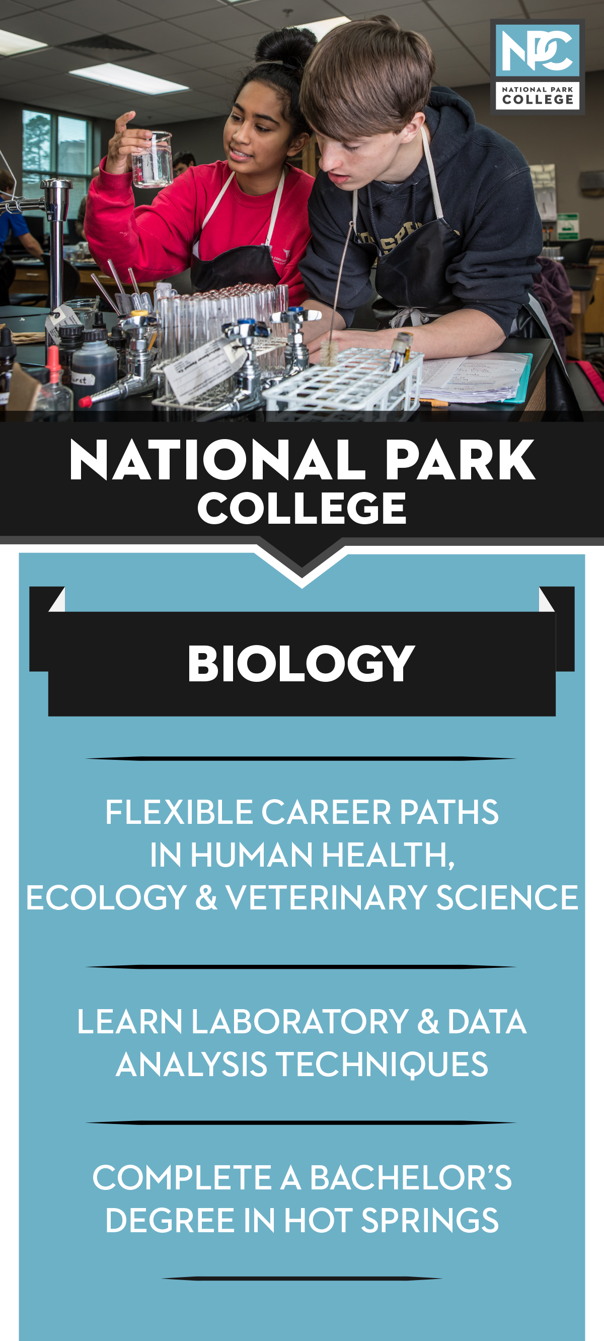
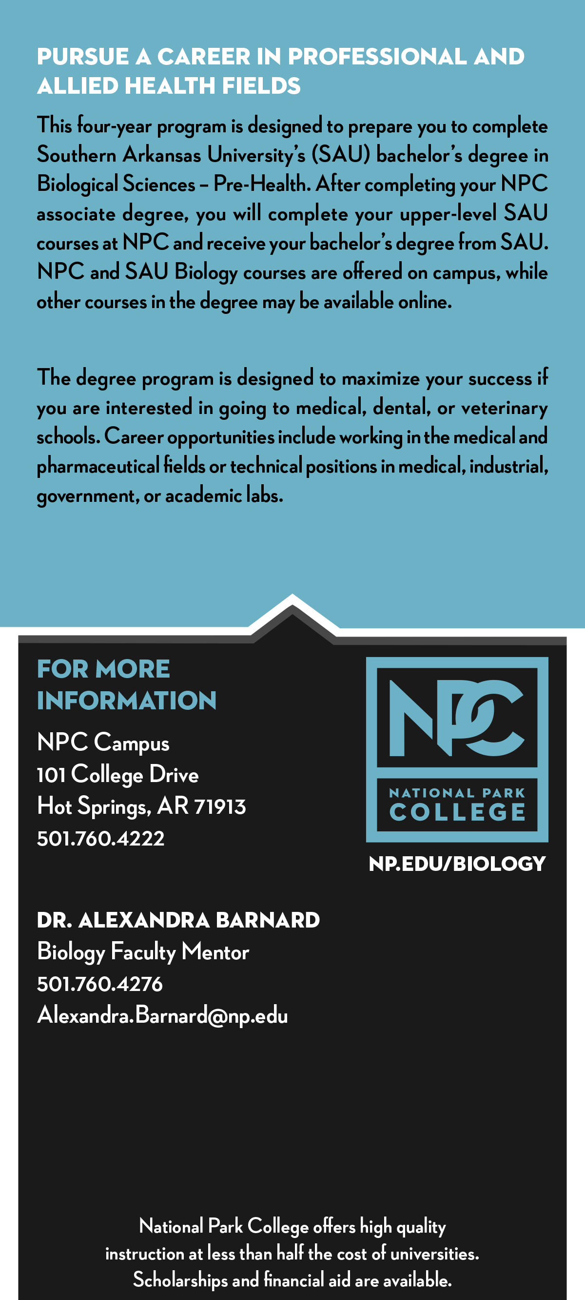
The Office of Marketing and Public Relations covers the cost of 4x9 inch rack cards for all programs. Rack cards feature the following:
- Program specific photography (when available, stock photography if not available)
- 3 most important points about the program
- A couple of paragraphs about the program format and job opportunities
- Contact info and a direct URL to the website for more information
Cards will be created or updated each June. This allows time for printing and delivery before the new recruitment seasons begins in fall. Extensive revisions are only completed if significant changes have been made to the program.
Quantity will be determined upon need and size of the program. Cards may be reordered mid-year if budget allows. 500 cards is approximately $80-100 and may take two weeks or longer to receive from the vendor.
Email Banners
Email banners can be created at varying sizes depending on the platform used for the email (such as Mailchimp). Email banners are simple graphics consisting of a striking wide-shot photo and possibly a line or two of text.
Campus Monitor Slides
Campus monitor slide graphics are displayed on TV monitors throughout campus. These graphics are ideal for communicating event details or other information pertaining to students such as financial aid opportunities or registration dates.
D2L Graphics

D2L graphics are displayed in D2L announcements for students and/or employees to view. These graphics are ideal for communicating event details or other information pertaining to students and/or employees such as financial aid opportunities or registration dates.
Submit a graphic design request by visiting our online service desk.
Best practices
Typography
Serif fonts have small strokes attached to the end of the main strokes. Sans-serifs fonts do not have these strokes. And script fonts are made to look handwritten. It is important to know which one of these fits the style and mood of your poster. Most script and decorative fonts have low legibility which slows down your reading because you are busy trying to figure out what letters are. These are best used in moderation if at all.
When mixing typefaces, the general rule is to use at most three fonts. Be aware of the mood of the fonts you are using. Fonts that would be appropriate for a child’s birthday card would not be appropriate for a business newsletter.
Ensure your fonts are legible. Not all fonts are designed with legibility being their primary function. Adding a colored box can help. Use text sparingly and do not outline your text. Use contrasting colors instead.
Color
Color can be a great visual impact when used correctly. Colors should be chosen to deliver an enhanced aesthetic appeal and a better user experience. That means it is a good idea to think about what color scheme you will use at the start of the design process. The way that colors are combined can either add to the look and feel or detract from it.
We all know our primary colors (Red, Yellow, Blue). But when you look at a color wheel you see the full spectrum of color. Complementary colors are two colors across from each other on the wheel and can be used to cause tension and make colors pop. But be careful using these together in type as they have a harsh contrast and make it difficult to read.
Visit Color.Adobe.com and explore different color themes that might fit your design.
Hierarchy
Establish a hierarchy. Determine what is important in your design. You typically have a few seconds to grab a person’s attention. Whether they are scrolling through Facebook or walking down the street, you are going to need to figure out a great way to grab their attention. If a person is in a hurry to get to class, they are not going to want to stop and read a lot of text on your flyer. They are going to want to see the event name, location and time, and then they may skim to see what it is about.
Accessibility
For a document to be accessible, it must meet the following requirements.
- Perceivable: The contents of the page must be detectable to everyone, no matter what their disability. They cannot be hidden from people who cannot see small print, for example.
- Operable: All users must be able to interact with the components. For example, a website must not provide buttons that can only be clicked by using a mouse, since some people with disabilities cannot use a mouse, and instead use a keyboard, voice control or some other interface.
- Understandable: All users must be able to understand the meaning of the information.
- Robust: No matter what a graphic looks like or what it contains, it has to remain accessible – able to be used and understood – on a wide variety of devices and using a wide range of assistive technologies, like screen readers. It must also remain accessible as more advanced technologies and devices are developed and used.
It is important for any graphic to be perceivable. Ensure the pertinent information for your event is displayed and there is contrasting color, readability, enough information, but not too much information. The viewer should be about to get what they need without too much noise and understand what they are reading. Fonts should be legible with contrasting color.
When creating a print graphic, several things to help with the above things are:
- Limiting column width – this makes the flyer more scannable
- Avoid chunks of italic text – readability
- Avoid overuse of different styles – causes confusion and information gets lost
- Follow language rules
- Avoid using unusual words. The results of an ample study on adult reading proficiency
introduced by the U.S. department of education clearly indicates that the average
American people still read and assimilate information at a basic 8th (or even 7th)
grade level.
- the length of your sentences
- the number of characters comprised by your words
- the number of words included in your text that are comprised of multiple syllables
If you are preparing something for digital disbursement, every piece of text in an image will have to represented in Alt Text. Alternatively, best practice would be not to have text in images, so the screen reader is not “cluttered.”
Avoid using images/pdfs/word documents when the same info could be communicated in writing. Some individuals may not have a PDF reader on the phone or computer, or the internet connection could be too weak to load the graphic.
If you need to footnote something, you should not use an asterisk, as they are not readable by screen readers. Screen readers will read the asterisk as the Unicode (U+002A). It is better to use the word Note: as this is readable text. However, it would be considered acceptable to use a picture of an asterisk if alt text is included.
Photography
Although cell phones have improved, the photos they produce may not meet quality standards in some cases. Do not hesitate to reach out to Advancement to schedule a photographer for an event.
All photography to be utilized for College purposes must be the property of the College, obtained from a paid subscription, or downloaded from a “free use” content provider. Google Images is not an appropriate resource for photography. Please ask Advancement for assistance in acquiring photo assets that will not violate copyright laws.